Clockworks
image.png
It's 19-10-25 , 1:21 AM , its raining outside.
So I am making good ol clock in react, I have built this
couple of times in canvas , lets see if it can be made using just css
now if you see what makes a clock, there are few components involved and some mechanics.
Components :
- circle(clock structure)
- hands(hour , min , sec)
- ticks(those small ticks you have where numbers are placed)
- time digits in front of ticks placed
Mechanics : well the mechanics are quite simple , the three hands move/rotate right , so we need to rotate the hands in sync with actual time we can get from time library in js.
lets start:
- making a circle is quite easy , you just need a div and with CSS you can set its Broder radius to 50% and you get a circle.
1. The Circle
Making a circle is quite easy - you just need a div and set its border-radius to 50%:
.clock-circle {
  width: 600px;
  height: 600px;
  border-radius: 50%;
  position: relative;
}
Without border-radius: With border-radius: 50%:
[ square box ] → ( circle )
Why position: relative?
Here’s the thing , we’re going to place a bunch of stuff inside this clock: hands, tick marks, numbers. And we want all of them to be positioned relative to the clock’s center, not the browser window.
Think of position: relative like setting up a coordinate system. When you make the parent element relative, anything inside it with position: absolute can move freely within that parent.
It’s like saying: “Hey browser, this circle is now the reference point. When I position things inside it, calculate everything from this circle’s boundaries, not from the edge of the page.”
So if I say “put this thing at 50% from top”, it means 50% down from the circle’s top edge, not 50% down the entire page.
This is exactly what we need! We want everything - the hands, the ticks, the numbers, to be contained within the circle and positioned relative to its center. The position: relative on the parent gives us that freedom to place things anywhere inside.
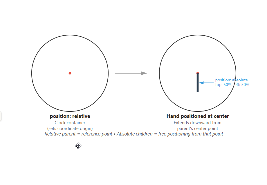
Parent: position: relative        Child: position: absolute
┌─────────────────┐              ┌─────────────────┐
│    (circle)     │              │                 │
│                 │     →        │      [item]     │ ← can move freely
│                 │              │   positioned    │    within parent
└─────────────────┘              │   at 50%, 50%   │
                                 └─────────────────┘
Without this setup, everything would be positioned relative to the browser window, and our clock would be chaos.
2. The Hand Problem
Making the circle was easy. Issue was the hands.
For this type of stuff I’ve mostly used canvas, cause it’s coordinate-based and you can use math. So my mental model was based around that. But let’s see if we can do this with CSS.
What do hands need to do?
A hand is like a line, right? So a div with small width and elongated height should work.
.hand-hour {
  position: absolute;
  top: 50%;
  left: 50%;
  height: 40%;
  width: 10px;
  background-color: black;
}
top: 50%, left: 50% places the hand’s top-left corner at center.
Clock (600×600):           Hand positioned:
     (0,0)                      (0,0)
       ┌───────┐                  ┌───────┐
       │       │                  │   ┬   │ ← hand starts here
       │   ●   │        →         │   │   │   (300, 300)
       │       │                  │   │   │
       └───────┘                  └───┴───┘
    (600,600)                  (600,600)
The hand extends downward because CSS flow is top-to-bottom. height: 40% = 240px (40% of 600px).
Now there are few things I need to deal with:
-
Direction: The div points down by default. How do I make it point outward from center to the circle’s edge at different angles?
-
Specific angles: How do I make it point to say 1 o’clock or 3 o’clock?
-
Pivot point: The div has two ends. I need the center end to stay fixed at the clock’s center, and the outer end to rotate around it. It should originate from center and grow outward.
The Pivot Problem
So here’s what happens by default when you rotate: Default rotation spins the hand around its own center:
Hand before rotation:      Rotating 90° (default):
    center ●                   center ●
      ┬
      │                        ────┼────
      │
      ┴
   (both ends move!)          (both ends move!)
The hand spins around its own center - both ends move , like spinning a pencil , both ends move , we want one end to stick and other to move.
- if one end it fixed near the center , then the outer end can freely move like a hand.
We want rotation around the clock center (top of hand), not the hand’s middle.
So what I found is transform-origin:
transform-origin
.hand-hour {
  transform-origin: top;
}
This sets the pivot point to the hand’s top edge, centered horizontally (default).
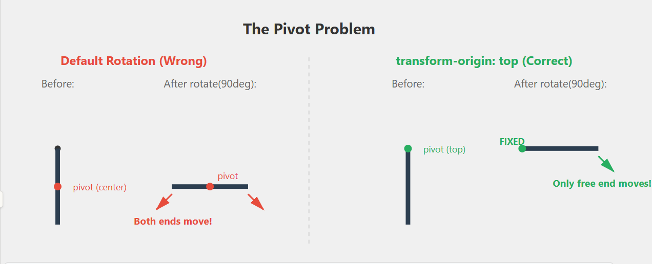
transform-origin: top         After rotate: 90°
    ● ← pivot (fixed)            ● ← pivot (fixed)
    ┬
    │                          ────┤
    │
    ┴                          (only free end moves!)
Now rotation happens around the clock center.
Without transform-origin:     With transform-origin: top:

    ●                              ● ← FIXED
    ┬                              ┬
    │                              │
    │                              │
    ┴                              ┴ ← traces circle

(both ends move)               (only outer end moves)
Moving the Hand
Great, so now we have a static hand that originates from center, grows outward, and we can potentially move its free end while the center end stays fixed.
Question is - how do you actually move it?
Rotation
Modern CSS has a rotate property: it rotate element to the degree you specify , we would also need to do the math of time-⇒deg
rotate: 90deg;
```
So I can just rotate the hand to different angles.
```
rotate: 0deg → hand points down (6 o'clock)
rotate: 90deg → hand points left (9 o'clock)
rotate: 180deg → hand points up (12 o'clock)
rotate: 270deg → hand points right (3 o'clock)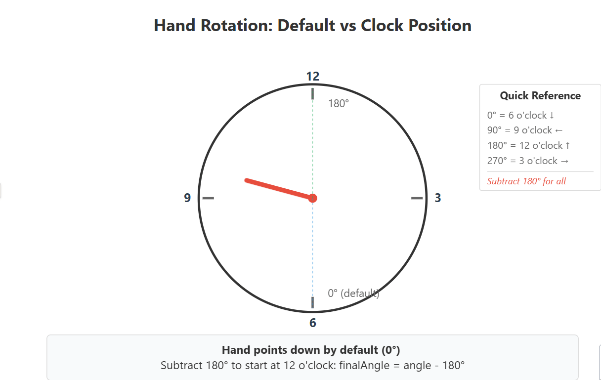 Wait, our hand points down by default at
 0deg. But clocks start at 12 o’clock, which is up. That’s 180deg.
So there’s an offset we need to deal with.
The Math
For a clock, we need to convert time to angles:
Seconds and minutes (0-59):
angle = value × 6° // 360° / 60 = 6° per unitHours (0-11):
angle = hour × 30° // 360° / 12 = 30° per hourBut, our hand points down by default. So we need to subtract 180°:
Why -180°?
The hand points down by default (6 o’clock position). But clocks start at 12 o’clock, which is upward - exactly 180° opposite.
Hand default (0°):           After rotate(180°):
      ●                            ●
      ↓                            ↑
   6 o'clock                  12 o'clock
So we rotate 180° to flip it upward. Now the hand starts at 12 o’clock like a real clock.
After that, all the time calculations work correctly - we just subtract 180° from every angle:
finalAngle = angle - 180°This shifts the entire rotation so 0° on our hand = 12 o’clock on the clock
3. Multiple Hands
Same positioning, different dimensions:
.hand-hour, .hand-min, .hand-sec {
  position: absolute;
  top: 50%;
  left: 50%;
  transform-origin: top;
}

.hand-hour { height: 40%; width: 10px; background-color: black; }
.hand-min  { height: 45%; width: 5px;  background-color: black; }
.hand-sec  { height: 50%; width: 3px;  background-color: red; }
4. The Tick Illusion
So ticks are basically the same as hands, right? They originate from center and point outward.
I need 60 of them, one for each second/minute position. Same setup - position them at center, rotate each one by 6° (360° / 60):
Core Concept
60 ticks = 60 divs, all positioned identically:
Array(60).fill(null).map((_, index) => (
  <div
    className="tick-mark"
    style={{ rotate: `${index * 6}deg` }}
    key={index}
  />
))
Every tick:
- Starts at center:
top: 50%, left: 50% - Extends outward:
height: 50%(300px) - Rotates differently:
index × 6°where index = 0 to 59
Tick index=0 (0°):   Tick index=15 (90°):   Tick index=30 (180°):
    ●                    ●                       ┬
    │                                            │
    ┴                ────┤                       ●
The Visibility Trick
Problem: Ticks look like full lines from center to edge. We want short marks near the edge only.
How do I make them look like small ticks at the circumference?
The Trick
Turns out, if you make 93% of the length invisible starting from the center, it looks like the tick grew from the circle’s edge inward, not the other way around.
Solution: Linear gradient makes 93% invisible:
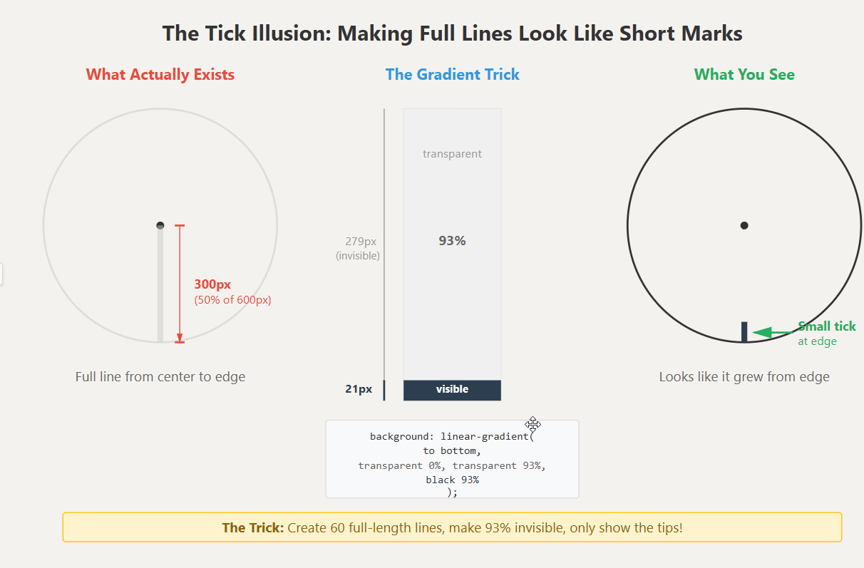
.tick-mark {
  height: 50%;  /* 300px */
  width: 3px;
  background: linear-gradient(
    to bottom,
    transparent 0%,
    transparent 93%,
    black 93%
  );
}
The gradient scale:
0%   ← top (at center)
|
|    transparent (invisible)
|
93%  ← transition point
█    black (visible)
100% ← bottom (at edge)

Actual pixels on 300px hand:
  0px - 279px: invisible
279px - 300px: visible (21px tick)
Why 93%?
Tick total length = 300px
Want visible portion = 20px
Invisible portion = 280px
Percentage: 280/300 = 0.933 = 93%
Result: Looks like 60 short ticks on circle edge, actually 60 full-length hands with 93% transparency.
So the trick is: create 60 full-length hands from center, make most of them invisible, only show the tips. Looks like short ticks at the edge, but they’re actually full hands with 93% transparency.
What you see:         What actually exists:
    ( tick marks )    =    ( full hands, 93% invisible )
5. Number Placement
Numbers are a similar problem to ticks, but unlike ticks, numbers aren’t lines that I can just start from center and make invisible.
So how do we place numbers in a circle?
From what I found, the trick is: place all numbers at the center, rotate them to point in different directions, then push them outward. But there’s a catch - if you just push them outward, they’ll be tilted. So you need to counter-rotate them back to upright.
The Three-Step -
The Transform Sequence
Place number “1” at 1 o’clock position using a hybrid approach:
<div
  className="numbers"
  style={{
    rotate: `${30}deg`,
    transform: `translateY(-260px) rotate(-30deg)`
  }}
>
  1
</div>
This does three things in sequence: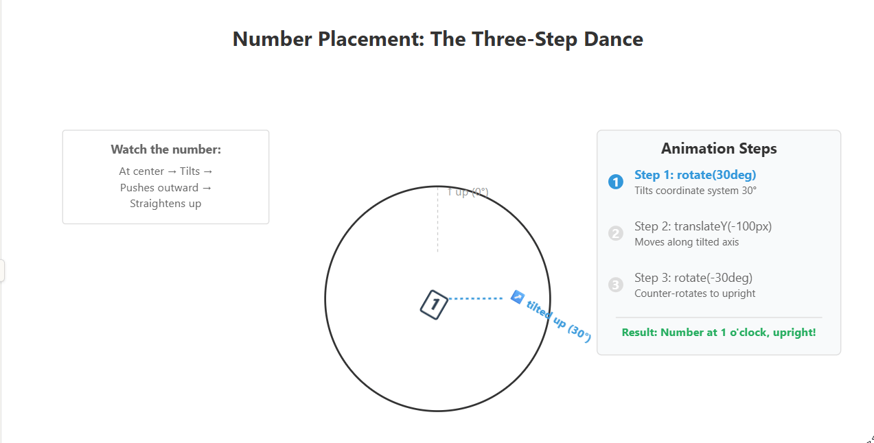
How It Works
Step 1: Initial rotation with rotate property
rotate: 30deg;This rotates the element 30° clockwise. The element’s coordinate system rotates with it.
Before:              After rotate: 30deg
    ↑ (Y-axis)           ↗ (Y-axis now tilted 30°)
    │                   ↗
    ●                   ●
Now “up” for this element isn’t straight up anymore - it’s tilted 30° to the right.
Step 2: Push it “up” in its tilted world
.transform property applies two operations
transform: translateY(-260px) rotate(-30deg);First, translateY(-260px) moves the element along its current (tilted) Y-axis:
After rotate: 30deg      After translateY(-260px):
    ↗ (Y-axis)               [1]
                            ↗
    ●               →       ●
Step 3: Counter-rotate to make it upright
Then, rotate(-30deg) counter-rotates it on its own axis to make content upright:
After translateY:        After rotate(-30deg):
    [1] (tilted 30°)         [1] (upright)
   ↗                         ↑

   ●                         ●
Visual Summary
Step 1: rotate(30°)      Step 2: translateY(-260px)    Step 3: rotate(-30°)
Point it in              Push it outward               Make it upright
the direction            along that direction          again

   [1]                        [1]                          [1]
	    ●          →           ↗                →            ↑
                             ●                             ●

(tilted 30°)            (moved to position,           (at position,
                         still tilted)                 now upright)
Why This Approach Works
The rotate CSS property and transform: rotate() both affect the element’s coordinate system. When you set both:
rotate: 30deg- establishes the base rotationtransform: translateY(-260px) rotate(-30deg)- operates within that rotated coordinate system
The browser applies them in this order:
rotateproperty (tilts coordinate system)transformoperations in sequence (translate along tilted axis, then counter-rotate)
Alternative: Single Transform Property
You could also write this using only the transform property:
<div
  className="numbers"
  style={{
    transform: `rotate(30deg) translateY(-260px) rotate(-30deg)`
  }}
>
  1
</div>
Both approaches produce identical results. The hybrid approach separates concerns but adds complexity.
Transform Order Matters
Correct sequence: rotate → translate → counter-rotate
Step 1: rotate(30deg)
    ↗ coordinate system tilts
   ↗
   ●

Step 2: translateY(-260px)
                       [1]
                      ↗ moves in tilted direction

                       ●

Step 3: rotate(-30deg)
                       [1]
                       ↑ makes upright

                       ●
✓ Correct! Number at 1 o'clock, upright.
Wrong sequence: translate → rotate
Step 1: translateY(-260px)
                       [1]
                       ↑ moves straight up

                       ●

Step 2: rotate(30deg)
                       [1] (tilted)
                      ↗ rotates in place

                       ●
✗ Wrong! Number straight up, not at 1 o'clock.
All 12 Numbers
function renderNumbers() {
  let tickarr = [];
  for (let index = 0; index < 12; index++) {
    tickarr.push(index);
  }

  return tickarr.map(function (item, index) {
    return (
      <div
        className="numbers"
        style={{
          rotate: `${index * 30}deg`,
          transform: `translateY(-260px) rotate(${index * -30}deg)`,
        }}
        key={index}
      >
        {index === 0 ? 12 : index}
      </div>
    );
  });
}
Position table:
index=0:  rotate(0°) + translateY(-260px) rotate(0°)     → 12 (at 12 o'clock)
index=1:  rotate(30°) + translateY(-260px) rotate(-30°)  → 1  (at 1 o'clock)
index=2:  rotate(60°) + translateY(-260px) rotate(-60°)  → 2  (at 2 o'clock)
index=3:  rotate(90°) + translateY(-260px) rotate(-90°)  → 3  (at 3 o'clock)
...
index=11: rotate(330°) + translateY(-260px) rotate(-330°) → 11 (at 11 o'clock)
Important: Use {index === 0 ? 12 : index} to display “12” at the top instead of “0”.
6. Animation
So far everything is static. TIme to move the clock
React state + setInterval to update every second:
Time to Degrees
const [Time, setTime] = useState({ hh: "", mm: "", ss: "" });

useEffect(function () {
  const intervalId = setInterval(() => {
    let time = new Date();
    let hour = time.getHours();
    let min = time.getMinutes();
    let sec = time.getSeconds();
    setTime({
      hh: hour,
      mm: min,
      ss: sec,
    });
  }, 1000);

  return () => clearInterval(intervalId);
}, []);
Every second, it gets the current time and updates the state. When state changes, React re-renders and the hands move.
Converting Time to Rotation
<div
  className="hand-hour"
  style={{ rotate: `${Time.hh * 30 - 180}deg` }}
/>
<div
  className="hand-min"
  style={{ rotate: `${Time.mm * 6 - 180}deg` }}
/>
<div
  className="hand-sec"
  style={{ rotate: `${Time.ss * 6 - 180}deg` }}
/>
The math:
Minutes and seconds (0-59):
angle = value × 6° - 180°

Why 6°?
360° / 60 = 6° per unit

Why -180°?
Hand points down by default, subtract 180° to start at 12 o'clock
Hours (0-23):
angle = hour × 30° - 180°

Why 30°?
360° / 12 = 30° per hour

Why just hour (not hour % 12)?
The × 30° already wraps it around.
15 × 30° = 450° = same as 90° (one full rotation + 90°)
Example at 3:30:45
Hour:   3 × 30° - 180° = 90° - 180° = -90° (points right)
Minute: 30 × 6° - 180° = 180° - 180° = 0° (points down)
Second: 45 × 6° - 180° = 270° - 180° = 90° (points left)
How React Makes It Animate
Every 1000ms:
  setInterval fires
  → gets new time from Date()
  → setTime() updates state
  → React re-renders
  → inline style recalculates rotation
  → browser updates CSS
  → hands move
State change triggers re-render. Inline style object is JavaScript, recalculates on every render. No manual DOM manipulation needed.
7. References
No trigonometry required: With canvas, you’d calculate x,y coordinates with Math.cos() and Math.sin():
// Canvas approach
const x = centerX + Math.cos(angle) × radius
const y = centerY + Math.sin(angle) × radius
With CSS, you just rotate:
rotate: 90degEverything positions from center:
60 ticks:     all have top: 50%, left: 50%
12 numbers:   all have top: 50%, left: 50%
3 hands:      all have top: 50%, left: 50%

Only rotation differs → creates circular placement
Illusions via transparency:
300px hand + linear-gradient(transparent 93%, black 93%) = 20px tick mark
No need to calculate "where tick starts and ends"
Browser handles visibility
Transform chains manipulate coordinate systems:
rotate(30°) → tilts coordinate system 30°
translateY(-260px) → moves along tilted Y-axis (not straight up)
rotate(-30°) → restores upright orientation
Result: element at angled position, content upright
React state + inline styles = animation:
State changes → re-render → style object recalculates → CSS updates
No requestAnimationFrame
No manual DOM queries
No imperative updates
Modern CSS rotate property:
Old way:  style={{ transform: 'rotate(45deg)' }}
New way:  style={{ rotate: '45deg' }}

Both work identically, but `rotate` is more concise for single rotations
Can combine: rotate property + transform property for complex operations
8. the fragments
The clock consists of 4 pieces:
- Circle:
border-radius: 50%+position: relative(coordinate origin) - Hands:
position: absolute+top/left: 50%+transform-origin: top+rotate - Ticks: Same as hands +
linear-gradientfor partial visibility - Numbers:
rotate+transform: translateY() rotate()(hybrid approach)
All elements position from center. Rotation handles circular placement. CSS eliminates coordinate math.
uhhh , yeah it ends , took me me less time to write the code than this.